Sorry for the long hiatus. I have been totally out of “running mode” and into “body building mode” (actually not joking). Just thinking of running generally made me nauseous for the 3 weeks after the race. Seeing people on the seawall out jogging just made me cringe. (People’s ridiculously bad running form doesn’t help.)
Anyway, despite that, I have been picking away at a data analysis for the 2012 Leadville 100. This post was going to be an analysis of just my data, but I basically needed the full analysis anyway, in order to prove my supremacy, numerically.
You may want to read:
Ok, so let’s get into it.
(If you haven’t already, you might want to take a quick (haha) look at the 2011 Leadville 100 analysis.)
1. Split locations
This is actually something I really wish I’d had for my race, and that I am including because I think it’s important.
When I ran my 50 miler, the aid stations were nowhere near where they were supposed to be. It hadn’t even occurred to me, before the race, to double check the course guide.
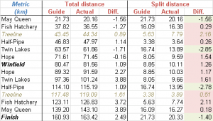
Well for Leadville, I had a chance to run the course any time I wanted, and did so frequently, so I knew the numbers were pretty good. However, since I didn’t know where the aid stations actually were, in a lot of cases, I couldn’t be certain. Well I can now. My trusty 310xt (thanks, Garmin! ps: please send me a 910xt in exchange for all the goddamn publicity I give you) has got the numbers for ya:
So rather than believe the race guide numbers, plan your splits according to the “Actual” columns. Both cumulative and split distances are included in the table.
You’ll note that May Queen and Twin Lakes are a fair bit closer than suggested. Treeline is a lot further away though! (Although, the guide doesn’t care much about treeline, since it’s not an aid station.)
For your sanity, pay attention to the split from Hope to Winfield. It’s 6.28 miles (10.11 km) and it’s very, very long. Prepare yourself mentally! Worst 10k of your life 😉
2. Split Paces
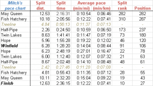
This is something I didn’t use at all, for any of my training, but it could be useful, particularly for pacers: average pace data. I didn’t really use my Garmin much for pacing (only to make sure I didn’t go too fast). But you might use it to get an idea of how fast to run each section, if you can’t train on the course.
As you can see from that table, my average pace was pretty damned slow. You have to factor in things like aid stations, pee breaks, etc. I was probably running ~ 30 seconds per km faster than what the average works out to.
My recommendation is that you set up your Garmin to show average lap pace only, and either hit the lap button at each aid station (or section change, e.g. Matchless boat ramp) or to auto-lap every 2 miles or something. No less.
Oh, one other thing is the split rank, and position. The last 2 columns of the table. We’ll get into split equality later, but you can see my strategy at work here. For example, from May Queen to Fish Hatchery, I was the 310th fastest runner. i.e. 309 people ran that section faster than I did. And I came into Fish Hatchery in 287th place. By Winfield, I was in 109th place, and my split was the 91st fastest of the race. By the end of the race, I ran from May Queen to Fish Hatchery in the 10th fastest time of the day! That, friendo, is the power of negative splits at work. (We’ll revisit this later.)
3. Registration & Finisher Numbers
Ok, here’s a big-ass table showing all the registration and finisher numbers, for both men and women, as well as percentages:
Woah, wait a second… Last year 42 % of registrants finished (345/824) and this year only 36 % did (363/1010)!! Of the runners, 45.7 % finished, but that compares to 56 % of the runners from last year!
Did I make a mistake somewhere? The Leadville race series people were all clapping and cheering for the higher number of finishers, but unless I’m mistaken, it would appear they were not comparing apples to apples. (They’d said it was 46 vs. 42) So in fact this year was a disaster, and only 18 more people finished despite 186 more runners having signed up! Oops!
Aside: I wonder what the worst year for finishing percentage was? I assume a year when it rained or snowed like crazy, otherwise, probably this one.
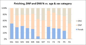
Percentage-wise, the numbers are actually really boring, showing almost identical percentage for both men and women, and boring variations between age groups, too. Women this year seemed slightly more likely to DNF than them men (~60 % versus ~46 %), in the F2 and F3 categories. But unlike last year, I’ll not invent a reason why that might be. It’s most likely just random, nothing to do with anything but the individuals who signed up.
Here it in chart format, for whatever it’s worth:
4. Finishing Times
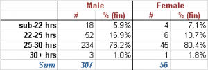
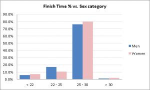
Ok, we’re slowly getting into some of the fun stuff now. Here’s the high-level breakdown of finishing times by sex:
That’s just how I think the results should be broken down. I arbitrarily decided that sub-22 was “badass”, sub-25 was “sweet” and sub-30 was “good”. Oh, and 30+ hours is “intense”.
Here it is in graphical form:
No real surprises there. Only 18 dudes went sub-22. Only 70 went sub-25! Ok, that is a surprise. I would have thought a lot more would have. For the women, just 10 went sub-25, and 4 of those went sub-22. Wait… Am I taking crazy pills? Is this not significantly less than last year? Lemme check…
No. It’s ok… Everybody calm down.
59 people went sub-24 last year. 56 went sub-24 this year. So a few less, but nothing ground breaking. Regardless, remember that only 363 people finished this race, out of the 795 who started: Finishing this race is a big challenge.
5. Section Splits: How fast should I run?
As before, the most interesting piece of all (at least to yours truly) is the course splits. As discussed in the previous analysis, it makes sense to break them up according to broad finishing time bins mentioned above: if you’re a 28-hour goal runner, you have no interest in seeing data lumped in with 16 hour finishers!
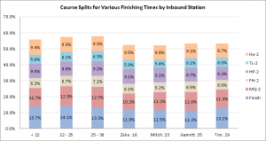
Here are the numbers, presented both in Cumulative Time at each aid station as well as splits for each section:
And here it is in bar chart format:
Ok, so let’s take a look. First of all, if you want to run sub-30, you don’t look at the sub-22 data, because it’s so skewed by the winners, who are inhuman. I’ll focus on this sub-30 group, because the sub-22’s aren’t reading this (they are out jogging up mountains with their photographers) and the sub-25’ers are obsessive enough to analyze the data meticulously themselves. (And if they’re not, they should be!)
So first of all, you’ll note the time to May Queen, on average, is 2:19. This is slow. Really slow. Take some walk breaks. Don’t pass a single person. Go pee if you have to. Enjoy a gel, consider a photo of the lake. Seriously. Do not go out with Anton, no matter how flowing and manly his gorgeous beard may be.
2:06 next to Fish hatchery is the average? Guess what? That’s pretty reasonable. Not too slow on the first trail bit. Jog the Hagerman Pass road. And walk the *entire* uphill section over Sugarloaf. Relax on the downhills. Don’t race anyone. I ran this section in 2:05, and I was passed by way too many people running way too quickly. Enjoy the sunrise.
And so on… I won’t go on. Because this table is full of terrible information, the likes of which should not be used by anyway! For a hint as to why, note that the last section (May Queen to finish) took the average 28 hour finisher 3 hours and 50 minutes. He is walking the entire way. Slowly.
“So what do you suggest, Illustrious Mitch?!”
6. Even Splits
Marathoners run even splits. The 24-hour ultramarathon record (188 miles) set by Yiannis Kouros was run in almost perfectly even splits (3:20 marathon, 7 times in a row!) There is no evidence, that I’ve ever seen, that uneven splits are a better strategy, regardless of distance.
My goal, going into this race, was to run perfectly even splits. I figured if I could do that, I could run a 22 hour race. If I couldn’t, or if something went wrong, I’d have “enough time in the bank” to still come in under 25 hours, and big buckle. I knew, going in, that 11 hours to the halfway mark was very doable, for my level of fitness.
My splits were based on my analysis of last year’s data, which showed, in absolute terms, that a dude named Cory Johnson had run the most even splits, for someone near the 24 hour mark. This idea was based on the “Peterson Plan”, which showed that a 5-time winner, Steve Peterson, ran far slower in the early stages of the race than most would expect.
Note: My analysis of last year’s split equality data was somewhat crappier than this year’s, because I didn’t do the “2 methods” comparison, or calculate the split equality as a percentage of finishing time. So Johnson’s splits aren’t quite as good as I previously thought. They aren’t bad though.
So let’s see the data:
On average, people take 1:27 longer to get from May Queen to the finish than from the start to May Queen. For a half marathon, 50 % of which (or more) is perfectly flat. (Though the later portion is uphill, granted.)
May Queen to Fish Hatchery section is even worse, because Powerline is the mind-killer. And surprisingly, the sub-22 superstars don’t do tremendously better. Their “split inequality” (The sum of their negative splits, minus their positive split) was 11.2 % of their total finishing time, compared to 15 % for the sub-30 folk. Better, but not mind-blowing.
Unsurprisingly, the section from Twin Lakes to Hope is much faster on the descent than the ascent, by about 35 minutes for everyone. We don’t expect even splits across every section, though, only across the entire race. It starts and ends at the same point, after all, so uphills and downhills should roughly cancel out.
So are there people that bucked this trend? Well, it so happens there are a few.
So why aren’t people running even splits at Leadville? Well, there’s some reasons:
- Poor planning
- The terrain
- Fear
- Uncertainty regarding fitness levels
- Stupidity
Poor planning is the obvious one: it’s the same reason people run too fast in a half-marathon. We’ve all been there! Not having a pacing plan, not sticking to it, getting over-excited…
7. Split inequality: Who did it right?
Note that there are two ways to calculate “split inequality”, as I call it. The first is to assume that any deviation from even splits is bad:
- Get time difference between inbound and outbound, for each section
- Take absolute value of that time
- Sum all inequality to get a total
2nd method assumes that positive split in one section should cancel out negative split in another (which makes sense, particularly over Hope Pass!): Do the same calculation, but don’t take the absolute value of the positive split. Your total inequality is therefore less, (since you gained time back running down from Hope.)
The problem is, if you get some dude who went SUPER slow up Hope Pass, then sprinted down towards Twin Lakes like a crazy person, he’s gonna get a massively negative split for that section, which is going to make him look awesome. When in fact he is not awesome.
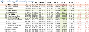
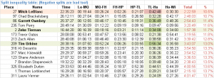
So you have to calculate the splits both ways and look for the guys who did well regardless of the calculation method. Here are some truncated tables of data for both methods:
(You can see how Jason Coleman and Jay Hunt made it to the top of the list in chart 1, but are nowhere to be seen in chart 2, due to crazy negative Hope to Twin Lakes splits.)
So, obviously, since I am the one writing this, I am going to draw your attention to how devastatingly I achieved my even-splits goal: I ran the most even splits of the entire race, on a percentage basis! (Impressive 2nd place finisher, Zeke Tiernan, was the only person who ran absolutely more evenly than me, by only 25 minutes, despite running 6 hours quicker.)
My May Queen to Fish Hatchery section really did me in, and I can’t argue my way out of that one: it was tough. Had I been in better shape (both physically, and lungs-wise) I could have gone a lot faster over Powerline, but I decided to play it safe and go slow.
Anyway, this is the result I’m most proud of, despite being quite a bit slower on the way home than I wanted to be. Or rather, I ran out too fast!
Ok, enough about me. (For now!)
I picked out three dudes who had run nice, very even split races, and run a variety of times: Zeke Tiernan (16:44), Garrett Ownbey (25:37), and Tim Urbine (28:38). Let’s look at these guys’ splits, and get a better than-average idea of how to run the race.
8. (More) optimum splits
I thought of doing a comparison between these results and last year’s, but the problem is that there were course changes, a new timing mat on Hope, etc. Let’s just trust that these guys ran a good race. (Zeke Tiernan’s race report. Can’t find the others’.)
Here we see that Tim Urbine, who ran a 28.5 hour finish, ran 2:37 into May Queen! Much slower than average. I mean, this is really a chill pace. Garrett, who ran a 25.5 hour finish, was 2:39 into May Queen! But guess what? When he came home, he ran a 2:52 over the same section. Granted, he was probably thrashing himself to try to sub-25, but he ran the most even splits of anyone in the race over that first section, (the bastard). That is damned impressive.
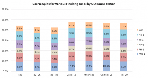
If we look at these guys’ splits on a percentage basis, what does it look like, compared to Zeke’s results?
You can see that these even-splits guys (hereinafter: “The Equable Gentlemen”) are taking like 5 % more time to get to Winfield than the average, regardless of finishing time. The vast majority of this is made up in the first section of the course.
Tim spent less time on the flat first section than Zeke did (9.3% versus 10.1%) but almost all his other percentages were identical, other than the last Winfield section. On the way home, he did well, but paid the price over that last section, and lost a fair bit of time there.
So anyway, you can dig into it a bit deeper if you want, the data is all there. But suffice to say that I think you’re best off planning similar splits to The Equable Gentlemen.
9. 24-Hour splits comparison
Ok, let’s go back and take a look at our new standards for even splits versus our old ones. Note that these are all scaled to a 24-hour finish, so if you’re shooting for sub-25, use one of these sets of splits! Let’s figure out which one is probably best.
I’ll point form a few observations:
- Garrett ran simply astoundingly even splits over Start to May Queen. Fantastic!
- Peterson struggled from May Queen to home
- Peterson was very fast to Fish Hatchery
- I was slowest to Fish Hatchery and Half-Pipe
- Garrett and I ran identical times to Twin Lakes
- Peterson was very fast to Winfield
- Garrett was fast to Winfield, but slower to Twin Lakes
- I was slower to Winfield and faster to Twin Lakes, though still uneven.
We can explain some of that. Peterson won the race, so his uphill times are relatively faster. His later times were slower, because he was running out of gas. And probably the course was very different when this “Peterson Plan” was published. So I would argue that they are no longer ideal.
Johnson splits were still good, but Winfield has since been moved about 2 miles further away. So it’s not likely that his Winfield splits are ideal. He also ran a 50 minute discrepancy from May Queen to finish.
Garrett did well, but ran too fast over Powerline. He ran a scaled 2:04, versus my 2:14 and later only ran 2:48 versus my 2:41. So even though I thought I did terribly over Powerline, it seems it wasn’t so bad. His and my Winfield times should be adjusted… He ran a scaled 3:27 & 3:38 to my 3:36 & 3:23. I’d say you might want to meet in the middle, and shoot for 3:30ish both ways. I seem to recall feeling good on the way back and mediocre on the out, so perhaps that makes sense.
10. DNF locations
This is a depression topic so I saved it for last. (?!)
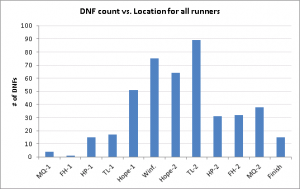
I figured out the locations of all the DNF’s, and plotted them for your viewing pleasure:
Pretty nice little distribution there. A huge number of people DNF’ing at Winfield, and again at Twin Lakes. A large number at Hope as well.
Now, the Leadville people told us “No one quit!” and we all cheered. I have no idea if that is true, but it means that everyone that DNF’d was cut because of time cut-off’s at the aid stations. This seems odd to me: how do more people drop at Twin Lakes inbound then at Hope? The race guide doesn’t even mention a Hope inbound cut-off, only Hope Outbound. So either my data is bad, or the guide is bad, or people dropped at Hope. Although how you drop at Hope is beyond me… Ride a llama down?
So anyway, we can’t read into this data at all, without knowing the details of how and why people had to stop.
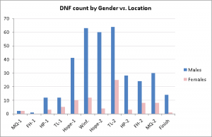
Here’s the breakdown between women and men:
Finally, something interesting! Women are much more likely to drop at Twin Lakes inbound than any other station. 31 % of them dropped at Twin Lakes, versus 16 % for men. And much less likely to drop at Hope inbound than the men (4 % vs. 15 %)
Again, I guess it’s tough to know why. If truly everyone was cut by time, then I suppose we could look at their cumulative times to see if that were true.
What does that mean though? To be cut by time? I mean, I lay in a sleeping bag in a medical tent just refusing to get up, drinking delicious Mr. Noodles, and the cutoff time goes by, does that count? I guess strictly speaking it means you didn’t walk up and get your bracelet cut off, intentionally.
Anyway, I find the DNF aspect of the race to be the most interesting one – shame we have so little data. Would be amazing to make a video of everyone that drops, just hear their stories. Would be epic.
11. Conclusion
How to conclude? Well, a few things stand out:
- The course is longer. The section to Winfield went from being shorter than listed to being a fair bit longer than listed. Practice that section, if you can.
- Running even splits, for me, worked amazingly well. I ran slower than nearly the entire pack going out. This helped me eat more, drink more, and save more for the trip home. I still don’t know if it’s truly the best way to run a race, but I’ve yet to see evidence that it’s not.
- This was the biggest year to date, with a low finishing percentage. Only 36 % of registrants finished! Be careful in training, but train hard. Take your registration seriously.
- Plan your splits. Know what it’s going to take to stay ahead of those cutoff times.
- Understand that there are mistakes (a lot of them) and omissions in the race guide!
Not much else to say. I hope you found that somewhat interesting and entertaining, but more importantly, I hope someone finds this info useful for their upcoming Leadville 2013 (or really, any race!) Please leave a comment if you have any questions or whatever. I’m happy to send out the raw data as well. This spreadsheet I made is in Excel 2010 format, so much nicer than the ODS one I had for last year’s data.
Next post is going to be Part 4: Training & Planning. I’m gonna lay out my training plan, gear, fueling plan, crewing plans, and all that fun stuff. Stay tuned.
Mitch out.



This is great info. I’ve often thought that this was just the way to tackle Leadville, and your “experiment of one” seems to bear that out. I will absolutely take those splits into account for my 2013 run. Terrific work.
As a data junkie I *love* this stuff Mitch! Sooo interesting.
For even splits vs negative or positive splits are you just looking at this race? I think some of the previous marathon world records have been very slightly negative splits.
I don’t believe a negative split in the marathon is a better strategy, I think it’s the result of marathoners not knowing their absolute limits. Indeed, how could you? When the records were set, they got to the limit, and found out they have more!
Furthermore I’m sure there’s a ton of strategy that comes into play. In both 100 milers and the marathon! But here I’m generally talking about the average runner, not what happens at the very limits of elite performances.