As you may or may not know, I have been basing my pacing strategy on a document by “Coach Weber” called “Leadville 100 Pacing Patterns and Charts“. Now, you may notice this page contains zero charts and that should be a red flag right there. Like dating a girl who hates dogs.
Now, in addition to the fact that I’d designed my pacing plan from a 14 year old document (did the internet even exist 14 years ago!?) I’m using “The Peterson Plan”, which itself is based on… A single person’s race from 16 years ago. Uh… Not a statistically meaningful sample size, clearly. Of course, physical variables like “distance” and “time” don’t change much over the years, so it’s not a totally bunk resource, but I thought: I should look at some more modern and comprehensive data.
Thus, I started analyzing the 2011 Leadville results.
Note: These are available online as a .PDF only. I don’t even want to tell you how long it took me to get it all into a spreadsheet. I curse every 2011 runner with more than 2 names, or a city with more than 1 word. “Colorado Springs, CO” may your namer rot in hell.
Ok, so here we go:
How many people finish the race?
You hear people saying Leadville is a tough race, because the number of people that finish is very low. Here are the numbers:
And here’s the results in a percentage bar chart:
From the numbers, we see that on average only 42 % finish the race. Of course, 1/5th of them don’t even show up. Of the people that do show up, roughly 53 % actually finish, so that’s not so bad. More than half, at least.
Last year there were 345 finishers, of the 824 that registered. The vast majority are men: 292 men finished out of 674, whereas 53 women finished out of 117. Percentage-wise, the women just take it, with 45 % finishing versus 43 % for men, and only 20% DNS’ing versus 23 % for men. So team Women takes it in toughness.
Of the various age groups, the group most likely to succeed is the F4 (women’s 40 to 49) with 59 % finishing rate. The group least likely to finish is the 20 to 29 year old men. Typical. Bunch of softie douchebags with no sense to slow down, I suspect. They’re also the group the least likely to start, with 31 % DNS rate! Higher than any group including the seniors!
(Note that I am not considering the 60 and older gang in these comparisons… basically the men’s 18 % finishing rate is very low, but they are really in a group of their own: the insanely hardcore, badass group. The thought of running 100 miles at 60 (let alone 70 or 80!) is simply … ridiculous. The rest of the seniors don’t even finish, but props for trying, certainly.)
Also worth nothing is the huge 47 % DNF rate in the F2 category, and their extremely low DNS rate. My only guess is that the younger women aren’t training as hard, are therefore not getting injured in training (so they actually make it!), and then crash and burn during the race. Of course, a DNF is preferable to a DNS. Or is it? Of course that’s only speculation, but regardless: you have to take 100 miles seriously!
In the largest category, Men’s 30-39, the finishing rate is 50 %. Still not good.
How fast do they finish?
Here are a few charts showing finishing times:
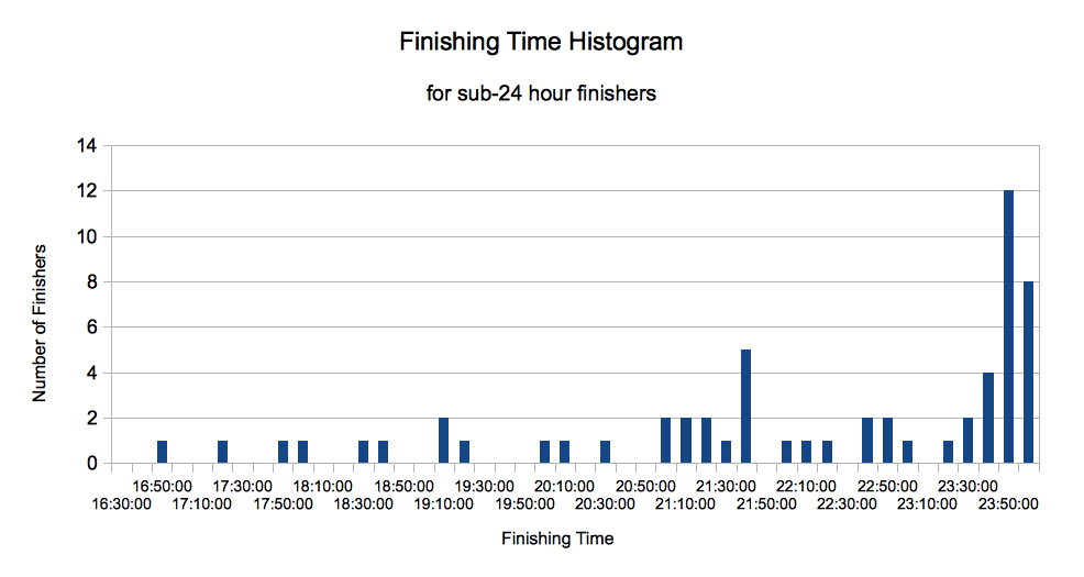
These graphs are interesting, and look like art, but not very useful. The only thing we can see is that there’s a huge drop-off in the number of people that go sub-22-ish. After that it increases steadily, and then there’s a large number that just squeeze in under 24 hours. Let’s look at this data in a histogram:
Here we see a pretty clear bump in people rushing to finish under 24 hours. After that there’s a big lull, with the very vast majority of runners finishing nearer to 27.5 hours and above!
To see just how exclusive sub-24 really is, here’s a close-up:
Section Splits: How fast should I run?
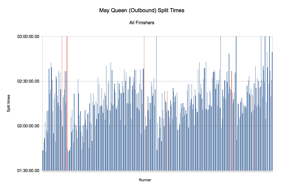
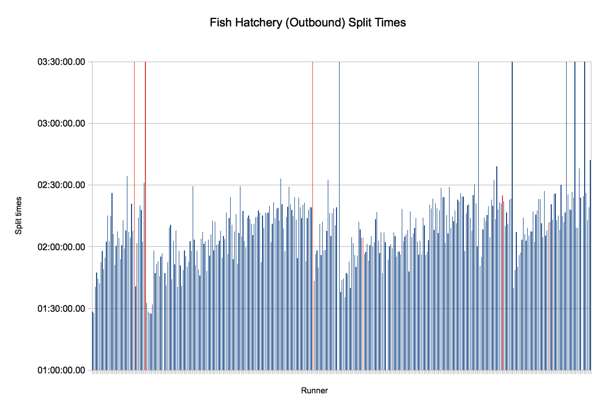
The really interesting data is the split times. Here’s the graphs for “Start to May Queen” and “May Queen to Fish Hatchery”:
The graphs look cool, but it’s tough to glean a lot of information from them. I decided to tabulate the splits in four different groups: All finishers, sub-25 hours, 22 to 25 hours, and sub-22 hours.
All Finishers (sub-30 hours)
The younger crew obviously go a little faster than the older crew, but in general the splits are pretty consistent. I mean, they have to be, if you want to make the sub-30 hour deadline!
If you want to play it safe and ensure a finish, this strategy is probably pretty safe. Here’s the summary for outbound, rounded off a bit to make it easier to remember:
- 2:20 to May Queen
- 2:15 to Fish Hatchery
- 1:30 to Half-pipe
- 2:00 to Twin-Lakes
- 4:00 to Winfield
If you do the math, this puts you at Winfield in 11:45, or 3:45 PM. Not bad. I won’t bother listing the splits coming home, because a) You can see them for yourself and b) after Winfield, you just do your best!
If you can’t hit these numbers, on the outbound, you are gonna be pushing your luck. There ain’t a lot of breathing room between here and the deadline.
Sub-25 hours
Sub-25 is the “Big Buckle” cut-off, and obviously almost everyone has this as as their “A goal”. It is a tough goal, and lots of very fit runners fail to achieve it. Only 92 out of 345 finishers (27 %) will finish sub-25. That’s only 11 % of the people who signed up, and 14 % of the people who started the race. Not a goal to be taken lightly.
Ok, things are starting to get a little faster. Here are the outbound splits for all the sub-25 finishers:
- 2:00 to May Queen
- 1:55 to Fish Hatchery
- 1:15 to Half-pipe
- 1:40 to Twin-Lakes
- 3:15 to Winfield
Ouch. That’s a lot faster. Total time to Winfield is now only 10:05! Of course, the average finishing time for this group is an extremely fast 22:37. So … we’re being biased a bit too much by the superhumans who are running sub-20, it would seem. This info is useless because if you’re fast enough to run 22, you don’t need someone else to tell you how to pace!! And if you need someone to tell you how to pace, looking at the winners’ average times is probably overkill. So let’s narrow it down, and look at the specific group of 22 to 25 hour finishers.
22 to 25 hour finishers
Ok, so now we’re looking at a more reasonable subset of data, for those of us hoping to just squeeze in under the 25-hour cutoff. I’ve included the difference between these and the sub-25 hour splits.
- 2:05 to May Queen (+ 5 min)
- 2:00 to Fish Hatchery (+ 5 min)
- 1:15 to Half-pipe (no change)
- 1:45 to Twin-Lakes (+ 5 min)
- 3:30 to Winfield (+ 15 min)
It’s interesting to note that the split to Half-pipe didn’t change! Why is that? It’s because the fastest runners are not faster on the flat sections, they are much faster on the hilly sections. Hence there’s a huge difference at Winfield, as well.
So if you want to be average but still shoot for sub-25, these splits are probably your best bet. They are fairly doable, resulting in a 10:35 to Winfield. Obviously the run home is the hard part.
Sub-22 hours
For completeness’ sake, let’s look at the sub-22 hour averages. There’s only about 24 people in all who ran sub-22, and that’s divided among 8 categories! Generally a sub-22 puts you in the top-5 for your division. Or top 3. Or top 1. It’s a very exclusive club!
Their splits looks like this:
- 1:55 to May Queen (- 10 min)
- 1:45 to Fish Hatchery (- 15 min)
- 1:10 to Half-pipe (- 5 min)
- 1:35 to Twin-Lakes (- 10 min)
- 2:55 to Winfield (- 35 min)
It’s interesting to note that the elites don’t come into May Queen that fast. Only gaining 10 minutes over the longest section of the course, a full half-marathon! As expected, the biggest time gains are the hilly sections, Powerline (the section to Fish Hatchery) and Winfield.
Anyway, we won’t dwell on that too much, because day dreaming of an average 20 hour finish is asking for trouble!
Comparison the Peterson Plan
How do these times compare to my 24-hour Peterson Plan? Let’s take a look.
They’re fairly similar. The difference (as clearly laid out by Coach Weber) is that the Peterson Plan is more even splits than the usual runner. The time lost in the early part of the race, particularly the beginning, is made up mostly over Winfield, and running back to Fish Hatchery and May Queen. The total time to Winfield is 10:25 for the M3 22-25 hr average, and 10:52 for the Peterson splits.
Now, the question is … is even splits better?
Split discrepancies per course segment
In marathon running, the ideal race is one performed at perfectly even splits. This allows to runner to keep his heart rate as low as possible at all times for a maximum average pace. Any excursion at higher speeds is very likely to take more out of the runner than is gained. Marathon records are set at an extremely consistent pace. It’s quite incredible.
By the way, if you’d like to read about marathon pacing in detail, I really recommend you check out the blog “The Science of Sport”. Here some great examples:
- http://www.sportsscientists.com/2012/04/london-2012-kipsang-keitany-conquer.html
- http://www.sportsscientists.com/2011/09/berlin-2011-inside-makaus-20338-world.html
The question however is: Do even splits make for a better ultra-marathon? Well, if we go by past results, the answer appears to be no. Tony Krupicka said: “To run even splits you’d have to go far too slow in the first half.” And to date, I don’t think I’ve ever heard of a race being run (and won) with even or negative splits.
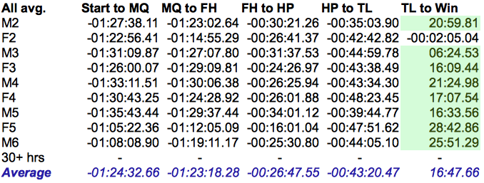
What I’ve done next is look at each section of the course and calculate the loss of time between the outbound and inbound. I did this for the various age categories.
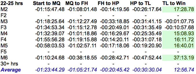
The table shows the difference between the first crossing of a section of course (outbound) and the second crossing (inbound). Negative time means you were going slower your second time through. Positive times, shown in green, indicate a negative split, that is to say the inbound was faster than the outbound.
I don’t know how much we can take away from this, but there’s a few interesting points:
- The faster the runner, the less positive the splits, i.e. the closer they were to even splits.
- The section over Hope Pass is typically faster coming home than leaving. The difference is more pronounced for slower runners.
- The last section of the course (May Queen to Finish) is brutal for everyone!
- The average finisher loses 4 hours on the inbound trip (final 50 miles, not counting time gained over Hope Pass.)
- The average 22-25 hour finisher loses 3:20 on the inbound trip
- The average sub-22 runner loses only 2:20 on the inbound trip
Again, we can assume the reason the fast runners see less negative splits over Hope Pass (Twin Lakes to Winfield, and back) is because they are able to run the uphills on the outbound section, and on the road to Winfield. The slower runners need to walk all these sections. Furthermore, on the return trip, the ascent to the top of Hope is shorter, and the backside (down towards Twin Lakes) is all very runnable. All these factors mean negative splits for weaker runners, but no real benefit on either side for fast ones.
It is remarkable that there’s an hour lost in the last section of the course (May Queen to Finish). Much of this is due to the fact that “The Boulevard” (the last 3 miles or so) is all uphill, but really, a full hour? And it’s not as though they are blazing the first half, either. Of course, they are running at night, so can’t go quite as quickly around Turquoise Lake… but my gut feel is that this shows room for improvement.
Individual splits comparison
Ok, so looking at the average is all well and good, but the average person is a fucking idiot; why would I want to do what they did? So I took all the finishers, put them in order of finishing time, and calculated their “split difference” in percentage. Then I summed the absolute values, to get a “total split inequality”. Because a positive split, to me, is as bad as a negative one. Even splits, I believe, are a goal worth striving for.
[Edit: I just realized that this “percentage” has absolutely no meaning whatsoever. I just changed the time difference into “percent” formatting, and forgot all about it. Haha. This displays how much of a percent of 24 hours the time is, e.g. 35 minutes is 2.43 %. The comparison is still meaningful, even if the value isn’t.]
Here’s a sample of that table:
I chose the three people with the very lowest total split inequality. Ryan Sandes (1st place, 7.5 % inequality), Brian Fisher (12th, 7.1 %) and Mathieu Brown (20th, 7.3 %). I picked one other runner, a guy who just came under 24 hours, but had a very low total split unevenness, Cory Johnson (57th, 8.3 %).
Note that there was one person with more even splits than Cory J. but his time was nearly identical to Mathieu B. so I just ignored that. Cory’s was the closest to 24 hours while still running even splits, which is, I believe, more useful.
Here are their actual splits:
So if you want to run sub-24 (or 25) you should probably try to hit Cory Johnson’s splits. If you want to go sub-22, I’d suggest trying to keep up with Mathieu Brown. Good luck with that!
Here’s the graphical format, showing their splits, for each section, on a percentage basis. (In this case, the % of the total finishing time, so a useful percentage!) You can see just how damned similar their splits were, even though Cory Johnson came in over 7 hours later than Ryan Sandes!
Johnson Splits
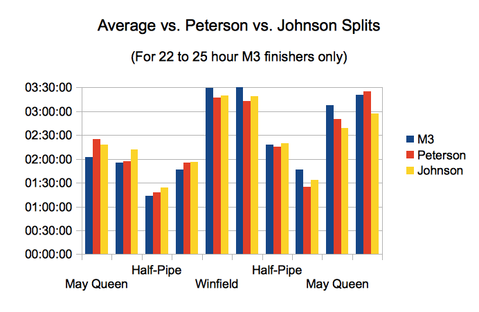
Ok, so now let’s revisit our Peterson Plan versus the M3 22 to 25 hour plan, and see how the Johnson splits compare to those. Here’s the data:
And in graphical form:
So what’s the story? Mr. Johnson came in at a very reasonable 2:17 to May Queen. From there, he was pretty slow getting over Sugarloaf pass (Powerline) to Fish Hatchery, coming in 15 minutes slower than even the Peterson Plan! He continued his slow and steady pace along the road, getting in 5 minutes later than Peterson to Half-Pipe. From here to Winfield the plans are almost identical.
For the return trip, Johnson took it easy going over Hope Pass compared to Peterson, but still came in ahead of the average. He maintained an average pace into Fish Hatchery… then, did Cory Johnson realize that the 24 or 25 hour cutoff might be slipping through his fingers? Because he absolutely crushed the finish, coming 30 minutes under average (and 12 minutes under Peterson) over Sugarloaf, and nearly 30 more minutes after May Queen!
Was he scared? Was he pushing super hard to get in on time, and break 24 hours? Or was he just running strong at the finish, the result of having been slow and methodical for the first 50 miles of the race? Unfortunately I couldn’t find any race reports or anything of the sort, so I guess we can’t ask him. Either way, he basically ran the same race as Ryan Sandes, he just did it slightly slower.
Keep in mind that the Peterson plan is based on Steve Peterson’s finishing times… and he won the race. As we saw previously, the difference between a strong runner and a weak runner, at Leadville, shows up in the hills. If a 24 hour Peterson Plan is simply a scaled up version of the 19 hour finish, it is probably too fast in the hills relative to the finishing time. Which would explain why the Johnson splits is so much slower over to Fish Hatchery. He’s slower over Winfield, both times, too.
Finally, we notice that Peterson is actually slower than average to the finish. Given that he’s winning the race, we can assume he’s battling, and simply struggling to maintain his target pace. Johnson suffers not at all from this, either because he’s a goddamn beast, or because he raced a bit more within his limits.
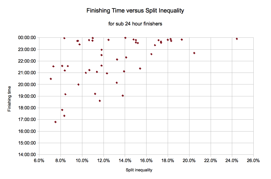
Let’s look at one more figure. This is finishing time (for all runners under 24 hours) plotted versus split inequality:
Does that graph convince you that more even splits is better? It seems the slower runners run more unequal splits, but does it go without saying that if you slowed down in the beginning, you would be faster overall? Hard to say. But if we look to marathons, in which the variables are under much tighter control, I think I shall assume the answer is yes. It’s a scary way to race, but it should yield better results!
Conclusion
I hesitate to draw any real conclusions, but it would seem that the Johnson approach is perhaps a bit better suited to a true 24 hour finish. If a runner is unsure about making sub-25, there’s really not much harm in running the Johnson splits, as most of the runners are going to do that anyway! Even if you bonk and have to walk-run your way home, you’ll still be doing fine to finish under 30. (Johnson gets to Winfield in 11:09, a totally reasonable 50 mile time.)
Hope you enjoyed the show. If you can think of any other ways to split or present the data, let me know. If you have any questions, I’ll try to answer them!
Mitch out.
ps: Don’t forget: Run your own race.


